How to change your stream overlay colours
An overlay in someone else's colours reads as a template. Matching it to your channel is the cheapest branding upgrade there is, and on these widgets it does not involve editing any code.
Step by step
Open the settings page that came with your download
Pick a theme from the list. The page shows a live preview and builds the link as you change things, so you can see the result before you touch OBS.
Try the colours on the product page first
Every product page on this site runs the real widget. Switch themes there and drop it on a dark scene to see how it holds up against gameplay before you buy.
Copy the new link into OBS
Paste the rebuilt link over the old one in your browser source properties, or re-save the .html file over the old one. Refresh the source and the new colours appear.
Check it against real gameplay, not a blank canvas
Colours that look great on the dark OBS background can vanish over a bright game. Preview with your actual game running behind it before you commit.
Picking colours that stay readable
Two rules cover most of it. First, keep strong contrast between the message text and the panel behind it — mid-grey text on a mid-purple panel is unreadable over anything busy. Second, give the panel some opacity rather than making it fully transparent; a semi-solid backing keeps chat legible over explosions and snow.
Matching your channel branding
Pull the accent colour from your logo or panels and use it for names and highlights only, keeping message text near-white. Using your brand colour for everything is the most common way overlays end up hard to read.
Widgets that work with this guide
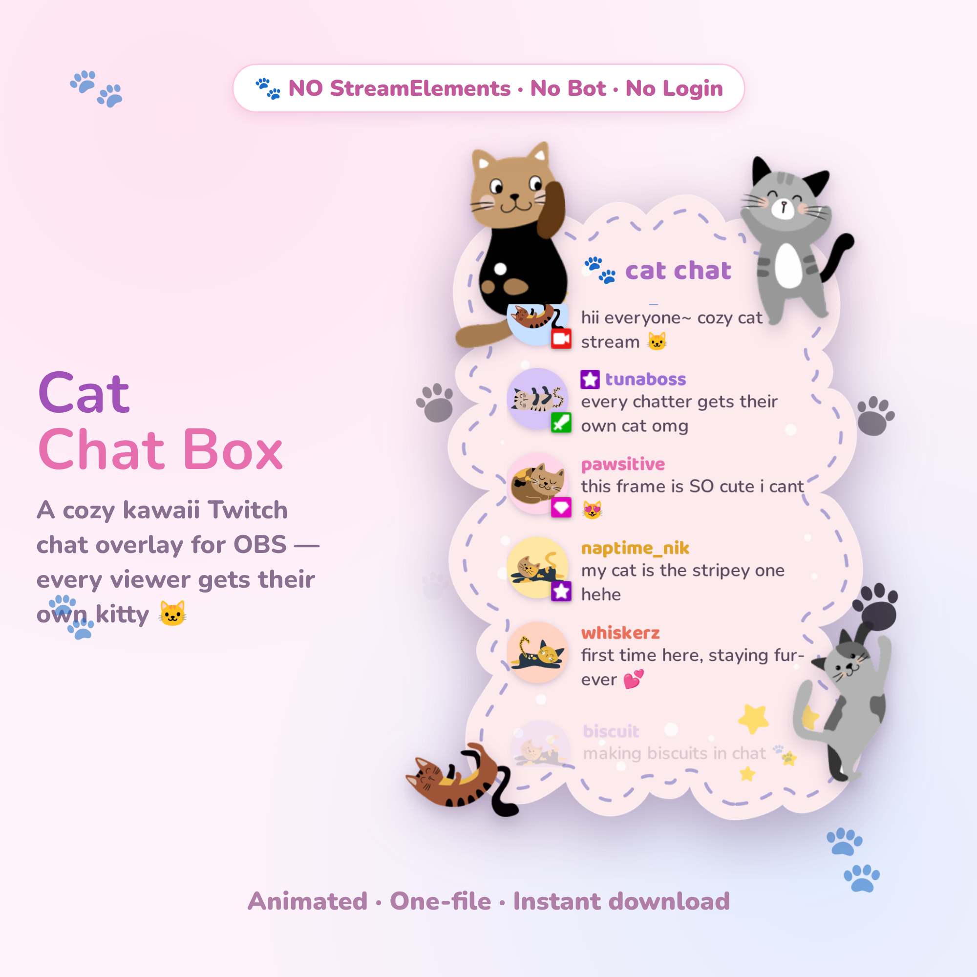 Try it live🎁 Free
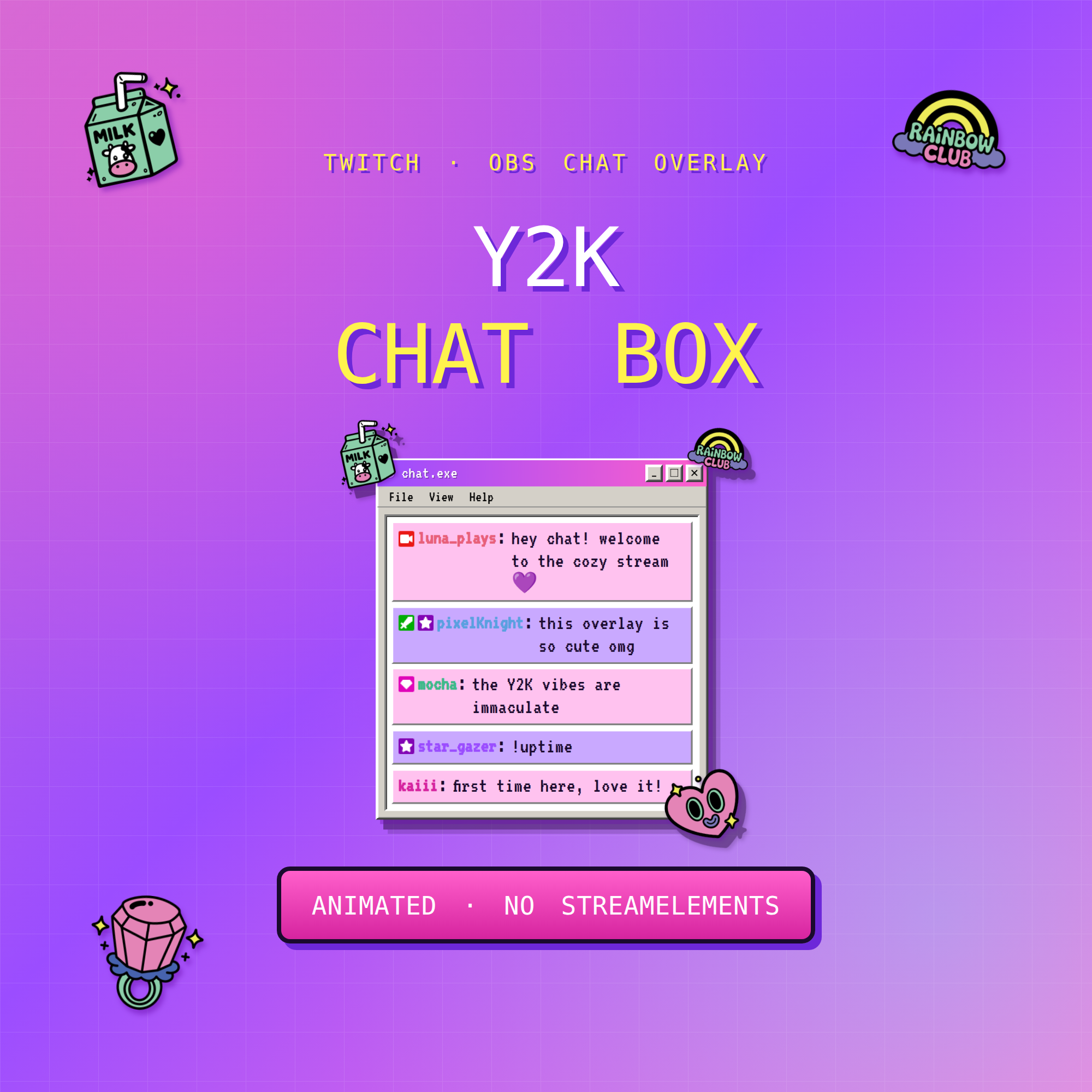 Try it live★ Best seller
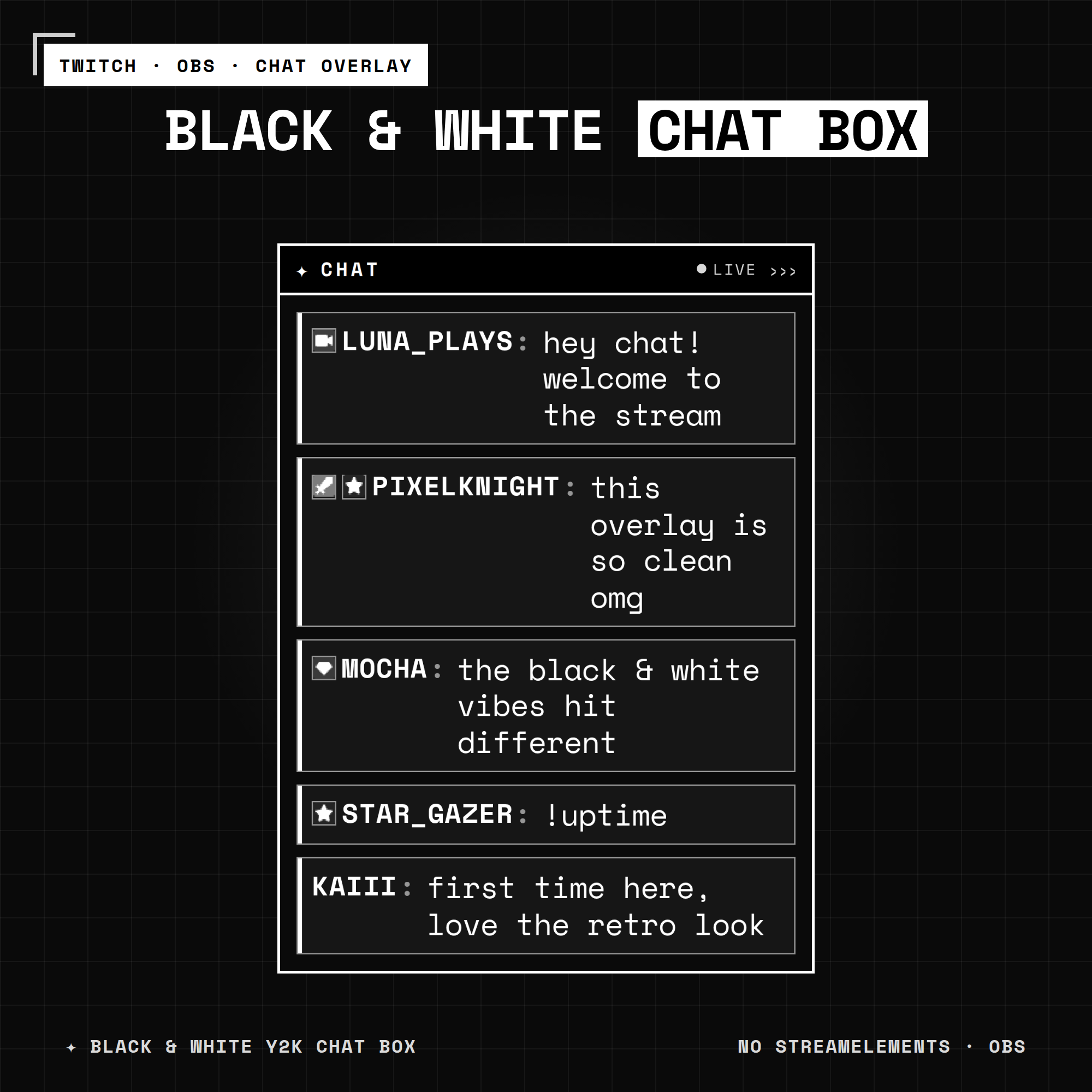 Try it live★ Best seller
Common questions
Can I change the colours of a stream overlay?
Yes. Open the settings page included with the widget, choose a theme, and it rebuilds the link. Paste that into your OBS browser source and refresh.
Do I need to edit code to recolour a widget?
No. The settings page handles it — you pick a theme and it builds the link for you.